

Scroll down for the good stuff
↓
01. Overview
02. My role
03. Challenges
04. Process
05. Final Prototype of Phase 1
06. Iteration of Phase 2
07. Reflections
01. Overview
Telekom tasked the company that I worked at, 480Hz, to display the Green Magenta program on a 32’’ touch screen in their shop. This is a module where campaigns and products on the topic of sustainability are brought together.
It was a two-phase project:
1. 4 topics, vertically displayed for the new Flagship Store in Cologne, opened in November 2021.
2. Expanded to more shops in Germany with an additional topic and horizontal adaption.

02. My role
I have led the user experience design process. After receiving the briefing and the first concept from MetaDesign, I have made research about the target users and went out to several shops to make a market analysis on similar projects. During the ideation process, I was in contact with the account manager to look for fulfilling the client’s goals. My initial concepts were created using rapid paper prototyping and Adobe XD, and then I worked closely with an Art Director and a Copywriter to polish the UI Design, before handing off the prototype to the front-end developer.

04. Challenges
Special considerations should be made when designing for large touchscreens.
During my visit to a Telekom shop, by observing and speaking with the shop workers I understood that there is low user engagement with similar touchscreen devices that are displayed on the wall. Therefore it was important to understand why this was happening and how might we invite the users to interact with the new module while having an engaging and comfortable experience.
05. Process
Interactions on Large Touchscreens
Touch hints
According to Shamonsky’s experiences, “Displays mounted on a wall or a stand tend to remind people of a TV and don’t imply that they are touch enabled.”
Eye scanning
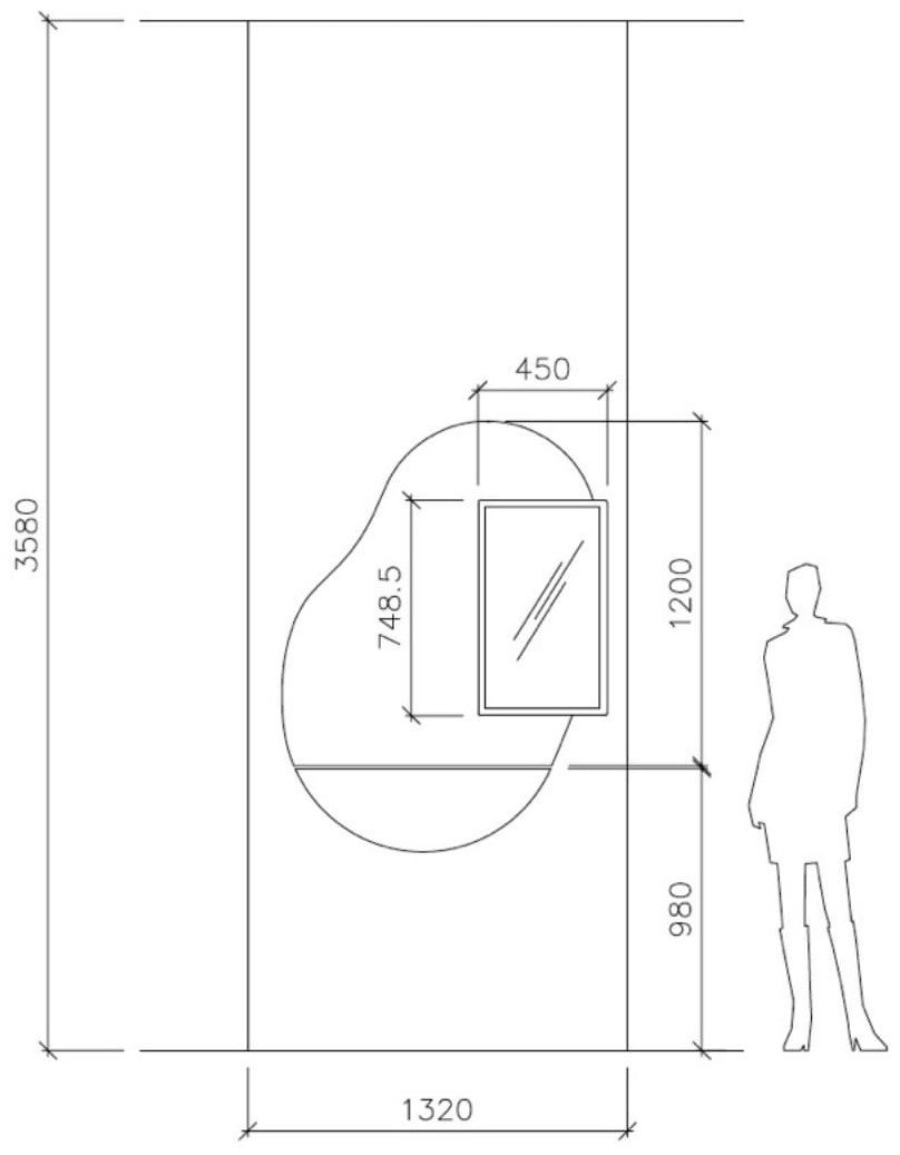
The larger the viewing area the farther away a user must stand to properly see the content. The priority content should not be too high up or too far adjacent from the area of interactivity.Arm motion
It requires a harder arm movement to interact with buttons that are placed on the top part of the screen.
Qualitative Research


Insights from observing and speaking with the target users and people working in the shops about a similar touchscreen module
Low engagement
Navigation on the top part of the screen requires more arm motion
Main content is all over the screen
“The clients rarely use this touchscreen. Maybe they don’t even know they can interact with it.”
Insights from the competitive analysis
Large CTA on the starting screen
Navigation menu on the bottom
Content too small and sometimes lost on the screen


Target Users
People who go to the shop:
Average age: 41 - 60 years-old
60% man, 40% women
13% are new customers
Main topics of interest:
19% mobile phone tariffs
16% Internet and DSL
14% smartphones
9% accessories
Sitemap

Guerilla Testing the Lo-fi Prototype


Variants for the hi-fi Prototype
05. Final Prototype of Phase 1
06. Iteration of Phase 2
07. Reflections
Designing for a large device displayed on the wall has significant aspects that have to be considered in comparison to other smaller touchscreens. Many people still associate them with TV’s and therefore don’t realise that its up to them to touch it to discover more. The final product displayed in the shops integrates a clear CTA to invite the user to get closer and interact with the device. The topics of this sustainability program from Telekom are displayed in a clear and organised way, providing the user with visual elements and cues for smooth navigation.