
+26%
Trust
2nd Place

Dual-Track Agile process, from Kevin Albrecht, adapted by Dottie Schrock
Product
B2C Website
Industry
HR Tech / Recruitment
Timeline
3 Months
My Role
Product Design, UX Research
Tools
Figma, Miro, VWO, Hotjar
Challenge
The existing navigation structure made key pages, like the About Us hard to find. Stakeholders each wanted their priorities highlighted on the top navigation, leading to a complex IA that confused users. People struggled to navigate confidently, and trust signals were being challenged.
Approach
I gathered qualitative and quantitative evidence (interviews, competitive analysis, card sorting, and testing) to build a data-informed case for a new navigation. I collaborated closely with product management, performance marketing and business stakeholders to align on the structure and language of the new navigation.
Key Insight
Users weren’t finding the "About Us" page not because they didn’t care, but because it was too hidden. Fixing the navigation directly influenced trust and conversions.
Process
Understanding the Problem
In a study conducted by the Market Research team, Trust in the company was the number 1 factor for customers to go with zolar. As the website was the first point of contact with zolar for many people, this was the place where they initially look to build that trust.
During interviews, hotjar recordings and usability sessions, I saw users consistently trying but struggling to find basic information, especially about who is zolar and why to trust the company.
Internal stakeholders assumed that the "About Us" page wasn’t important, since data showed that the user's were not clicking in it.
Key Findings
In a study conducted by the Market Research team, Trust in the company was the number 1 factor for customers to go with zolar.
During interviews, hotjar recordings and usability sessions, I saw users consistently trying but struggling to find basic information, especially about who is zolar and why to trust the company.
The About Us link was not intuitive on desktop.


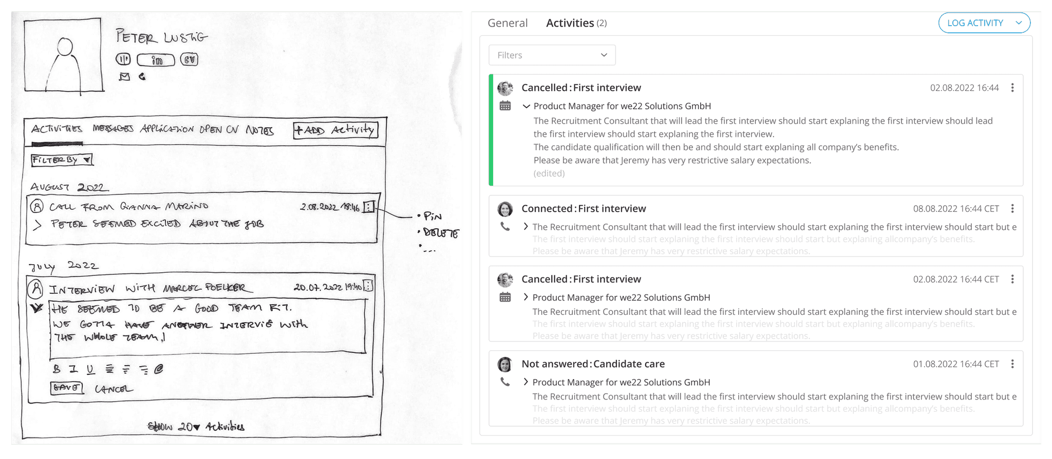
Persona based on user research with Recruitment Consultants
Market & Pattern Research / Gathering Evidence
Used UXtweak for a card sorting study with internal stakeholders.
Ran competitor audits to benchmark best practices for navigation and content placement.
Created a findability comparison of old vs. new nav (show visual).
Ideation / Alignment & Collaboration
Held alignment sessions with SEO, content, and brand teams (e.g., Yannick, Tanita, Julianne).
Balanced competing priorities by co-defining page hierarchy and naming conventions.
Pushed for clarity in CTAs, like changing misleading labels (e.g., “Prämie sichern” vs “Freunde empfehlen”).

User sketches during Ideation Workshop
Prototype / Building the Solution
Mapped an improved Information Architecture based on what users actually look for.
Proposed a new “Ratgeber” section — validated through competitor benchmarking and native speaker input.
Designed and tested desktop and mobile prototypes to validate usability.
Lo-fi vs Hi-fi activity tracker screens
Developer Handoff
The design was delivered in Figma using reusable components and documented flows. I supported QA during dev handoff to ensure pixel and logic accuracy.
or
Testing & Implementation
Conducted usability tests to confirm improved findability.
Handoff to devs with clear specifications and collaboration for QA.
Ran a VWO A/B test between the old and new nav.

Developer handoff
Outcome
A simplified, user-friendly top navigation that:
Improved findability of trust-building pages like About Us
Created a consistent user experience across devices
Supported SEO and content goals through clearer structure
Results
+26% conversion rate vs. baseline
“About Us” became the 2nd most visited page (Datadog)
Efahrer ranked zolar.de 3rd best for solar website UX
Learnings & Next Steps
Visibility ≠ quantity — relevance is key.
Involve users early and continuously — crucial to create a feature that would add value to them.
Adoption takes more than a good UI — the right processes and ways of working must follow.
The next steps would be to continuously evaluate the feature, while closely with users to make improvements and add new elements that will make their lives easier. Just like people change, it is also important to understand that the product needs to adapt constantly to their needs.
Collaboration between the users, the product and the engineering teams was key throughout the project.
Proximity and empathy allowed us to ship a solution that was not only functional — but trusted.
➕ Optional: Continue Reading
If you’re curious about the full design process, including how I structured co-creation sessions and made design decisions along the way, I documented it in this Medium article →